Hip to Be Square & Random
Incorporating grids and patterns in your illustrated journal or art, plus inspiration from a hospital floor
Hello!
Fair warning that there’s a lot stuffed in here today. I’ve been walking the halls. I think coming weeks will be short, though, so pace yourself.
There is a dividing line in today’s post, a threshold between “talk” and “art,” between personal and public, between past and present. Feel free to jump to the pictures if you want to skip the colorful floor and the layering of memories sparked by the tile pattern on Floor 6. The second half is a series of images of assorted grids from old journals.
Something happened two weeks ago that set off monitors and sent a flurry of doctors rushing into the bathroom in the hospital room, much to the surprise of the person who was using the bathroom.
“Was that a Code P,” I asked, when the story was relayed to me later.
…
Thank you for reading.
Amy
"Design is the intermediary between information and understanding." — Hans Hoffman
Hospital Layout
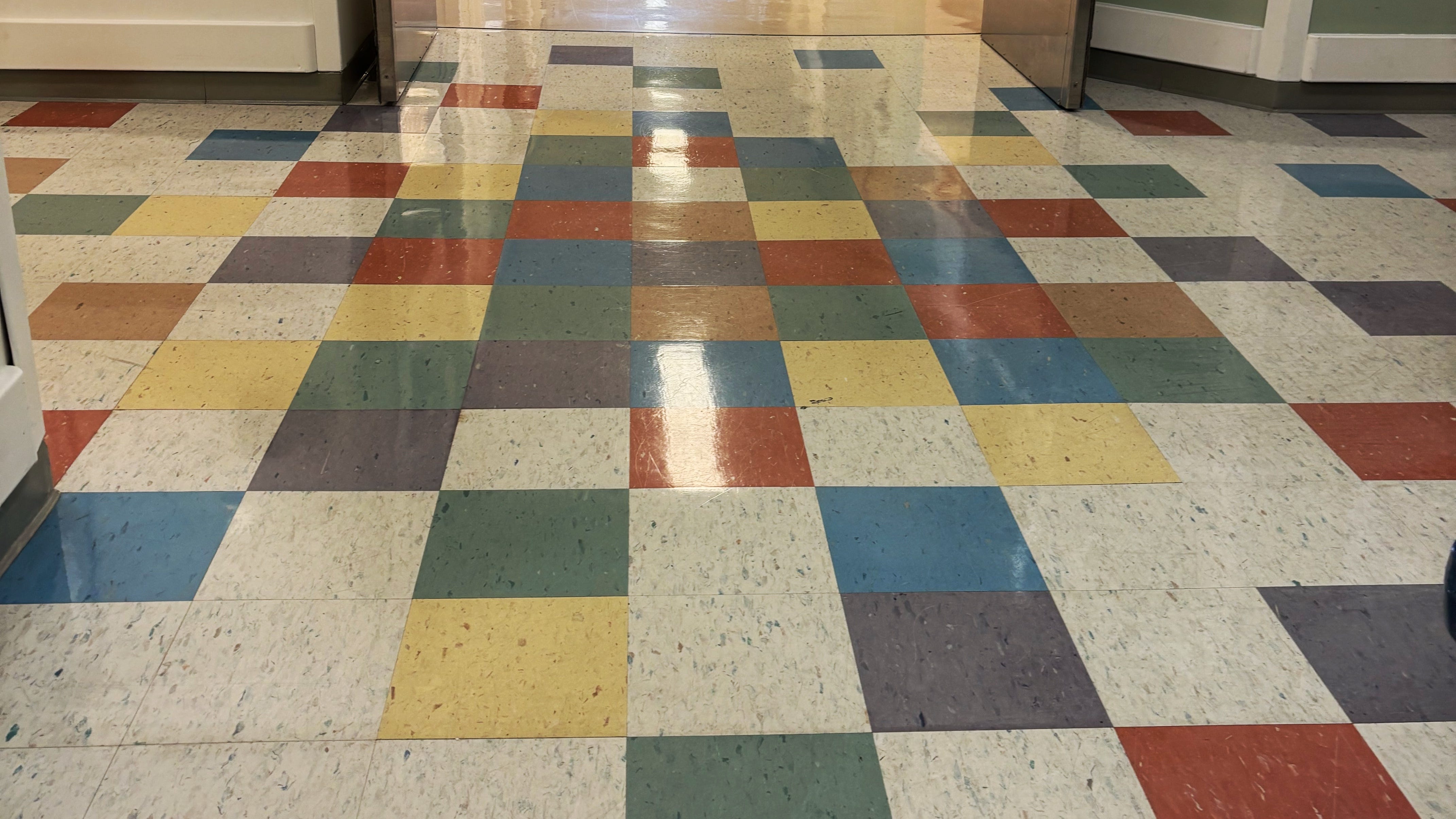
I was leaving the hospital one day last week. A room change had put us on Floor 6. As I walked the long hallway to the stairwell, I noticed the floor.
There are colorful tiles all over the floor near the middle of the long hallway and again at the end. Most of the floor is industrial, a speckled neutral, but on Floor 6, there are patches of color. The colors are soft but striking, purple and blue, green, yellow, and red, clustered and then scattered, a muted version of the palette I use week to week in some of my diary comic projects.
I was heartened by the unexpected color, but the randomness of the pattern jumped out at me. I kept trying to make sense of the colors, kept trying to find the repeat, find the rule of the spatial arrangement.
But I was also confused… How had I never noticed these tiles before? Are these tiles on every floor? Surely not. I’ve been in and out of this hospital at least a hundred times. Maybe I’ve been on Floor 6 before, I reasoned, but I always used the back elevators.
After puzzling for days, it finally struck me that maybe this floor was once a pediatric floor. (I can’t remember now what floor we were on the one time we landed in the PICU.) That felt like it might make sense. There is a new pediatric hospital on the other side of town now, so maybe this floor used to be something different, something that warranted cheerful, colorful square tiles. Maybe we were here, once upon a time, and I never noticed the floor.
The non-repeating pattern of the colored squares intrigues me.
The more I look at it, the more I love it.
When There Is No Pattern
I find it interesting when you see something like this that is irregular and that has no discernible repeat, no guiding principle, no apparent order. I know this can bother people. It didn't bother me, but it did register. It made me look. How did they decide where to put the colored blocks?
It is often harder than one might think to make something appear random and have it visually work, have it still be aesthetically pleasing.
As someone who has done a lot of freeform quilting, I embrace irregularity and randomness. I tend to eschew (quilting) patterns entirely. But I do appreciate that not everything that is completely random looks good. There is an art to making random work. I doubt they just willy-nilly pulled tiles from a bag to make that floor. Someone carefully designed that patternless pattern.
I scanned the colored tiles for repeats. I looked for points of symmetry. I can’t say for sure that the entire patch of floor isn’t the repeat. It may be. It may be that the patch at the end of the hall is a direct repeat of the patch in the middle, maybe even a patch that has been lifted and rotated, which would further obscure the repeat.
The person laying that tile would have to have been someone with no decision fatigue. Should I put yellow here? Or green? Or blue? There is a purple right there. I can’t use purple again so soon. Or can I? That red one would have been better if it was green. How many yellow are there?
Stand back and squint. Does anything jump out? Does it feel balanced?
🖍️ Throwback: Did you color in those Roger Burrows pattern books when you were a kid?
Grids and Squares
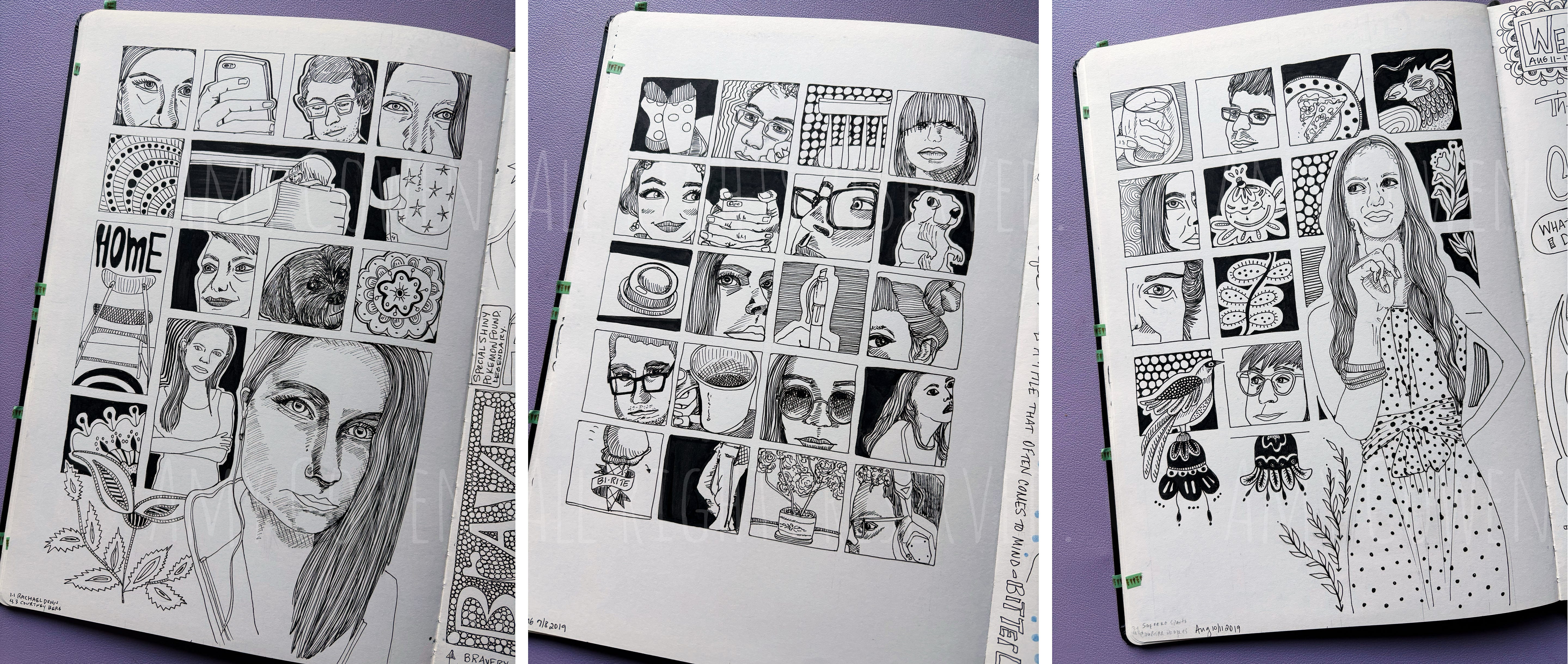
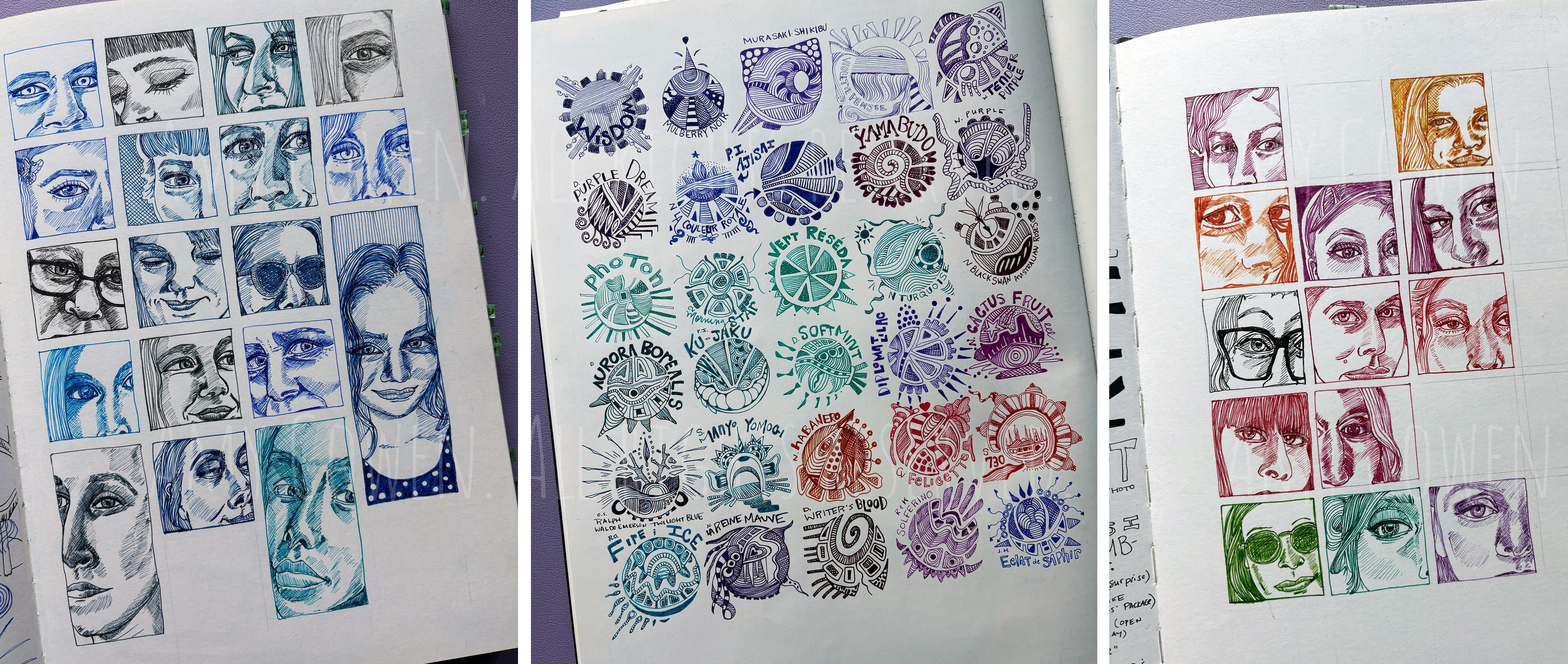
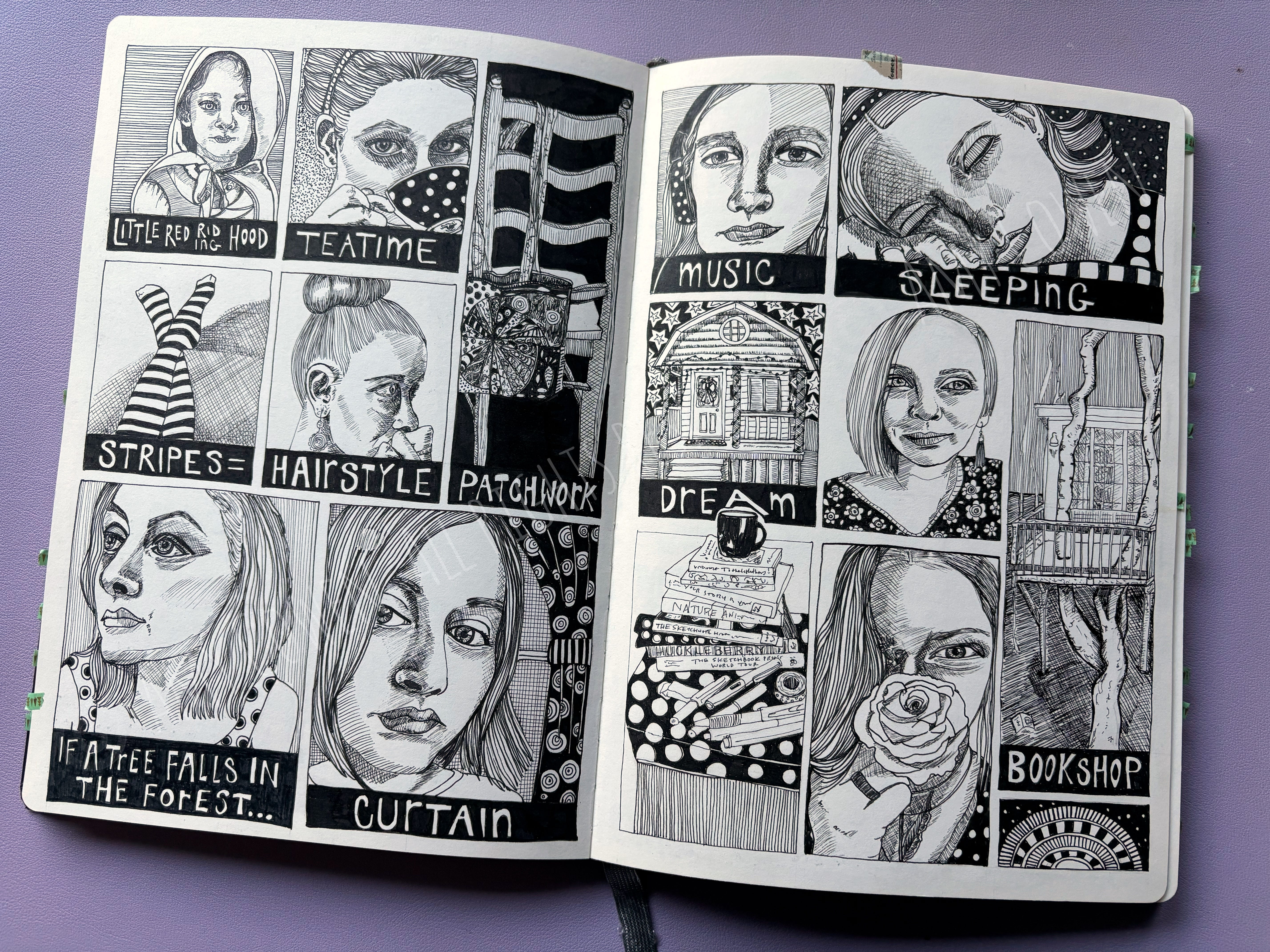
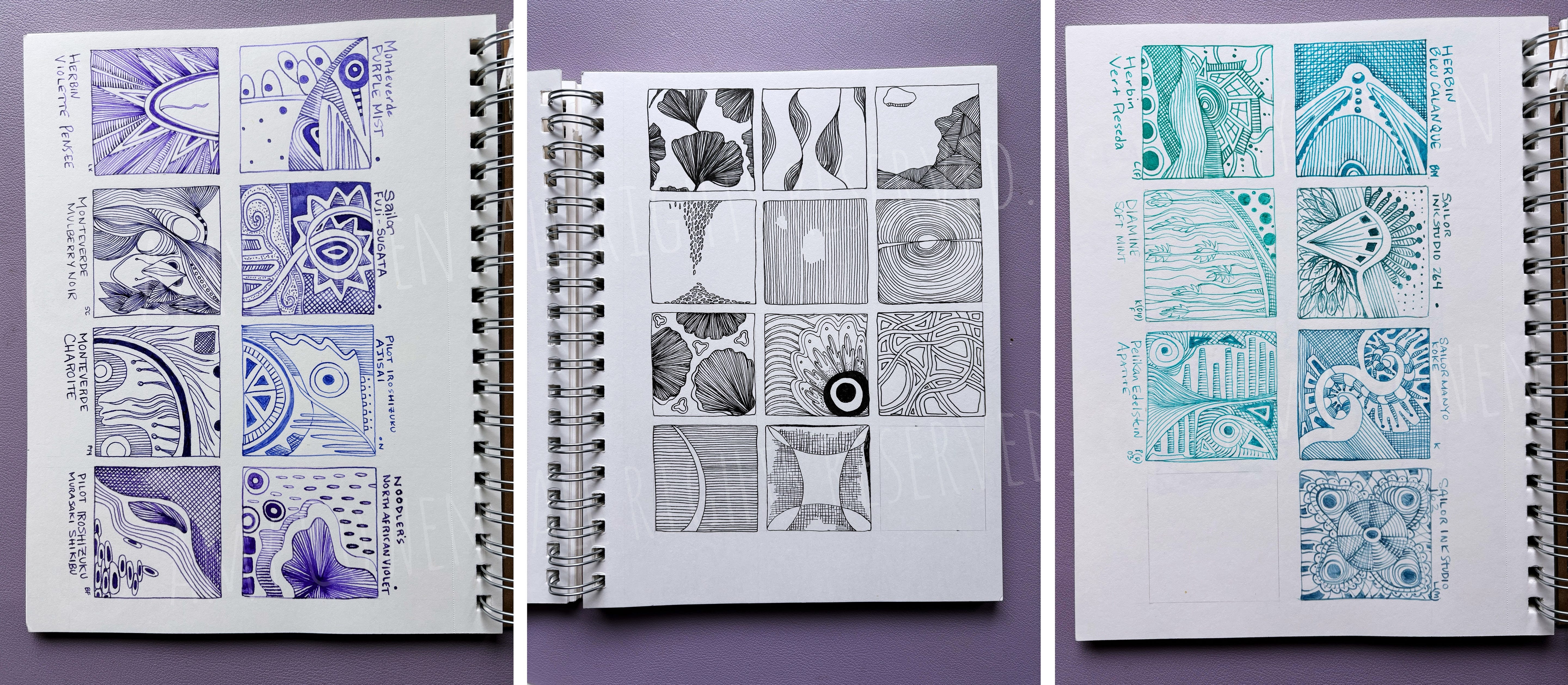
Inspired by the floors this week, I thought I would share a few examples of grids.
I love grids in all forms. Even when they are subtle, grids have always been central to my aesthetic. Grids can be really helpful when thinking about composition in an illustrated journal. Through the years, I have done all kinds of gridding, from very precise and concrete gridding (drawings in squares) to looser gridding in which the layout follows an invisible grid.
Sometimes filling in a grid is an exercise in mindfulness. At times, I have created grids with the intent simply to fill in the space, square by square. Sometimes, my mindfulness grids have been made of circles.
I find grids peaceful. I appreciate their structure, their bones. I appreciate their clear lines and yet embrace their flexibility and fluidity, too.
I flipped through some old illustrated journals and snapped photos of a few grids.
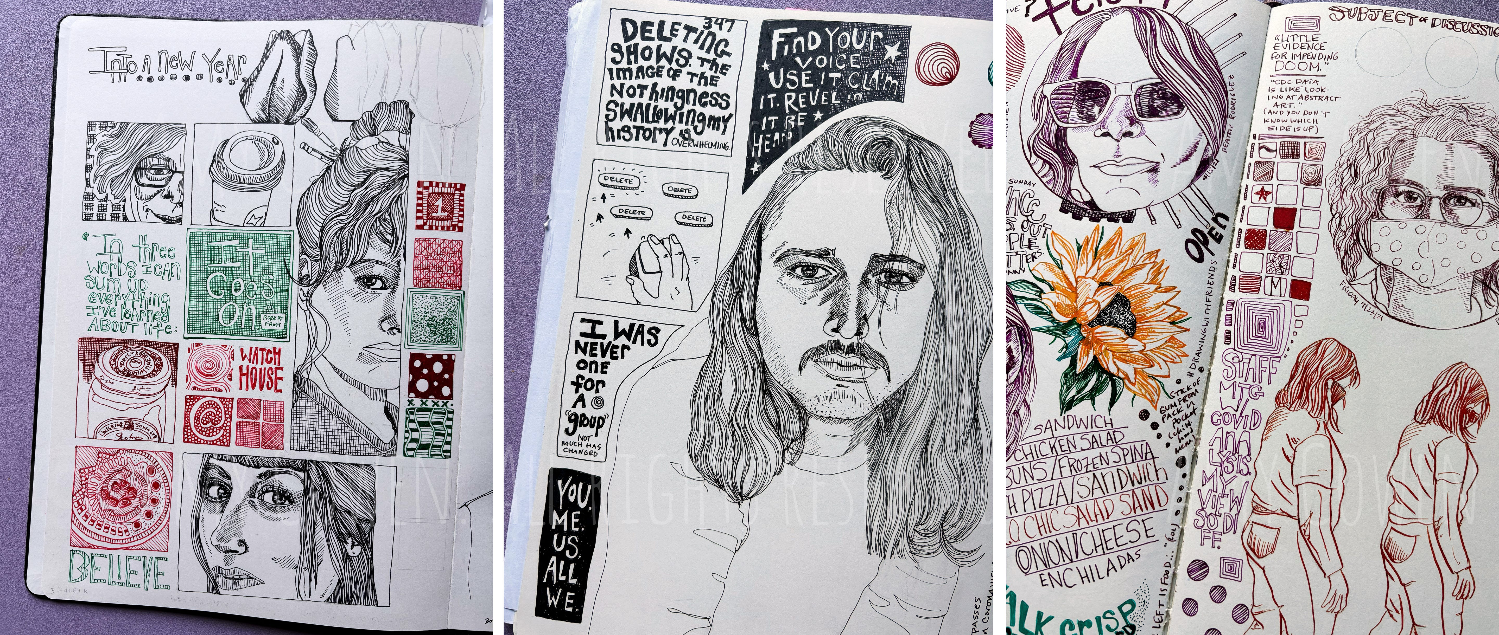
(Most of these are standalone pages, some of which were for different challenges or series. I have lots of pages of diary graphic novel recordings, which are heavily gridded, too. Talking about composition in an illustrated journal is something I’ve wanted to do here. Maybe I can show additional samples of gridding in my Illustrate Your Week pages some other time.)
Weekly Bits and Pieces
Comic Affirmations, 92-100 (final days)
Made It?
Thank you for reading. I appreciate your comments. Let me know what stands out for you, what you think after reading, or where we connect.
I appreciate those who offered suggestions last week for affirmations. Some of your suggestions sent me looking or thinking or interpreting or mulling. Some of them nudged me in a certain direction because parts of what you offered really jumped out at me, and I heard them through my own lens in a way that personalized those words for me, maybe even differently than you intended them.
I love that about words. I love that about the affirmations project and the process of coming up with the words that we see as touchstones or use as worry stones or repeat over and over as mantras in a day.
You shared some really thoughtful suggestions, and I incorporated at least one of them into my final week. I think the final week of the diary comic affirmations project has been my strongest so far.
I am really going to miss this project, and I don’t quite know what to do with that yet for myself. My schedule is going to be a bit off for the coming month, but I hope to do at least a recap of the 100 days next week. June is always a reflective month.
There is not a whole lot that is currently paywalled here, but I did gift 1-month subscriptions to several people for playing along with my crowd-sourcing of affirmations last week (even if I didn’t use the one you shared). Thank you, Laura, Kortney, Nan, and Elizabeth.
Please note: the downside of this is that when the gifted month nears its end, the Substack system will warn you of this, and then remind you of this, and so on. It’s going to feel like a ploy. It isn’t. I gifted the subscriptions as a thank you. You can just ignore those automated emails. (It happened to me recently, too, so I saw this in action.) Some of you who I gave 30 days to already are paid subscribers, and things may or may not look any different. You may not even know! It’s hard for me to tell.
(There will be a discounted offer in June, as well, I think, as a small game, so be watching.)
Jump in this week with:
A favorite poem or lines from a poem (inspired by Kortney’s sharing of a line from a poem last week — read the related post)
A book you are getting ready to read
Thank you to those who read and support this space. It means the world.
If you enjoyed the post, please share or re-stack. I hope that now and then you share the people you read. If you enjoy Illustrated Life, I hope you will consider leaving a recommendation.
Thank you for reading Illustrated Life. Please consider subscribing to receive the weekly email. Writers need readers, and I am grateful for every reader!
Paid options are available for those who can and want to support the Illustrated Life, the podcast, and the weekly #illustrateyourweek prompt series. Subscriptions not your thing? One-time donations are always appreciated.


My current fave poet is Jarod K Anderson ♥️
One of his is :
Hey.
Your matter recalls cosmic explosions
and you tasted oblivion before you learned your own name .
Fear nothing.
🌟🌟🌟
“The world is too much with us; late and soon,/
Getting and spending we lay waste our powers . . . .”
This has been in my mind lately, and popped up immediately when I re-read your “too-muchness” affirmation. You meant it, I think, in a slightly different way — though not unrelated. The darkness and the heaviness of things. At any rate, I loved your phrasing. Very ee- cummings-ish. Hmmmmm. Wordsworth and whimsy. I’ll have to think harder on that.
I’m captivated by your grids, especially ones with surprise irregularities. I wonder about the choices for each square, like you wondered about the selections in those hospital floor tiles. But how vast the choices with content and composition and line and depth of field (vs “just” color and position and rhythm). Your voice is so whimsical and so powerfully deliberate at the same time. Discursive and focused. Sly and forthcoming. I like how all of your various streams this week sing to each other. And to us.